top of page

Design Proposal
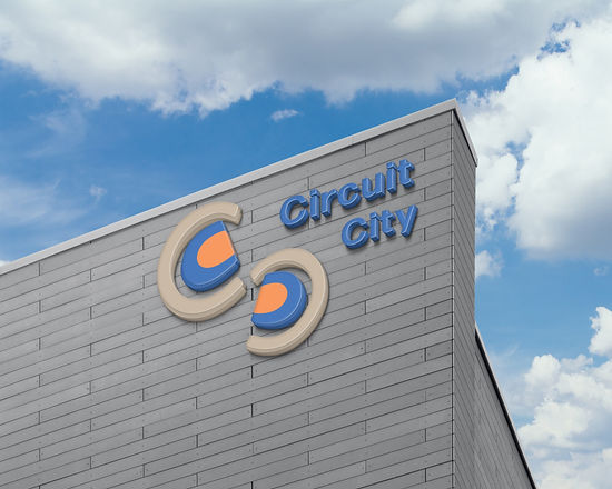
The color scheme that's used is the total opposite of what the brand had. These colors are more sophisticated. Since Circuit is included in the name, the C's represent that exactly. The elements inside of the C's are buttons since a variety of technology devices include them.
<a href="https://graphicsfamily.com/downloads/category/mockups/">Free Mockups</a>
App, Advertising, & Signage
The app design is straightforward and easy to explore. The ad below shows the importance of technology and how much it impacts people in their lives. In viewing this ad, it signals people to see that this brand has a lot for them.

 |  |  |
|---|---|---|
 |  |  |
 |  |  |
 |  |  |
bottom of page